


A navigation menu is one of those things that most people don’t notice until it isn’t designed well. Chances are that every website you have visited has some form of a navigation menu, but rarely do people rave about finding an amazing one. Like many jobs, doing it well means that no one notices.
What well-designed navigation menus have in common are basic usability rules that allow for visitors to seamlessly navigate through a website without thinking. These rules are essential to keep in mind when creating a navigation menu on your own website, whether it be for a business or for personal use.
1. Keep It Simple
There’s a reason that the saying “Keep it simple” has been around for so long. The goal of websites is to provide information, and creating any barrier to that information is counterproductive.
Limit the number of menu options
Since human short-term memory can remember about 7 items at once, only list 5–7 options on your highest level of navigation. Any more than this and you risk overwhelming people.
Use short names for menu items
Just as too many menu items can overwhelm visitors, long item names can be confusing. Most categories and actions can be described in a word or two, so there is no need to write complete sentences for menu options. Sticking with recognizable terms like “products” or “contact” is a good idea.

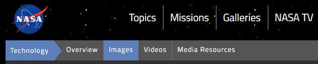
Limit the number of levels
Only use three levels in navigation menus: Top-level, first dropdown, and second dropdown. Flat navigation is a UI principle that decreases the layers of navigation to make pages easier to find on websites.
For SEO purposes, no page should be more than three clicks away from the homepage. For usability, the same is true. Deep navigation makes moving around a site harder and when that is incorporated into the navigation menu, things become chaotic.
2. Keep It Consistent
Consistency sets non-textual communication cues. Changing those cues is confusing and defeats the purpose of having them in the first place.
Match the rest of the site
The navigation menu should look the same on every page of a site, except for navigational cues (indicators in the menu that let the user know what page they are currently visiting). Changing the look of the menu from page to page makes visitors feel as if they are no longer on the same site. Moving any items from their original place in the menu is disorienting.
Keep consistency within the menu
If you are using dropdown menus, try to use them for every top-level option in the menu. Contact menu items are often an exception, but generally, users expect to have the same experience with every item. Switching between links and dropdowns makes things confusing.
3. Keep It Helpful
The navigation menu’s main job is to help. Without a helpful nav menu, visitors will leave your site in seconds and no one will see all of the great content on your site.
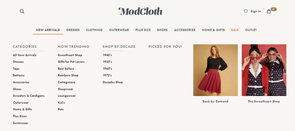
Create dropdowns
To keep site structure clear and the navigation menu uncluttered, create dropdown menus. This easily categorizes important pages without cluttering the navigation menu bar. Categorized items are easier to find and more options are available to users browsing the site.
Add a Call To Action (CTA)
Since the navigation is (usually) the first thing website visitors see, adding a CTA button increases the chance of conversions. This is also handy for visitors that have already browsed the site and have returned specifically to submit a contact form or buy a product.

Include a search bar
Including a search bar follows the same principle as a CTA. The search bar is easy to find in the navigation menu and serves as a navigation backup for visitors that want to save time. Even if a site has the worst navigation and structure in the world, users can find information by using the search function.
Put significant links at the beginning or end of the menu
According to the serial position effect, the mind recalls items placed at the beginning and end of a list the best. By including commonly visited pages in these areas, visitors will more easily find the popular information. The most common items at the beginning or end of the menu are the home page, main products and services, contact or about pages.
Establish navigational cues
Displaying color conventions, icons, or breadcrumbs help the user understand where they are located within the website.
For smaller sites, using a different text or background color is a good way to indicate what page the visitor is on. Larger sites can benefit from breadcrumbs, which more specifically show the page’s placement within the sitemap. While breadcrumbs aren’t technically part of the navigation menu, they work together.
4. Keep It Predictable
Usability is all about knowing what to expect! If items aren’t in the same place that they are on other sites, there needs to be an excellent reason that things are different.
Link the logo to the homepage
One main rule of UX design and SEO is to include a link back to the site’s homepage on every web page. The most familiar way to do this is to link the business or website’s logo to the homepage in the navigation menu. This is something that visitors are expecting and will save them from searching for a way to find the site’s main page.
Use a clear hierarchical structure
This point is related to limiting the number of levels in the navigation menu. While important to use flat navigation in the menu, it can be difficult to limit the site structure to three levels, especially on ecommerce sites. Using a clear hierarchy of categories ensures that the user can still find what they are looking for, even with multiple categorical levels.
5. Keep It Responsive
Not all menus are created equal. Keep in mind that screen real estate is more important on smaller screens than large desktop monitors. Be mindful of your users’ mobile experience.
Use a hamburger menu
Desktop menus take up a lot of space if you don’t collapse them on mobile devices. Most responsive beginner-friendly website builders automatically adhere to this rule, but it’s always a good idea to make sure that visitors have access to the same usability that they do on the desktop site.

Remove hover interactions
While testing for a responsive menu, remember to also remove any features that involve using a cursor, like hover interactions. Often, hover interactions are translated into screen taps.
For desktop menus that show dropdowns on hover, a screen tap to show the dropdown makes sense. But for menus that have more elaborate interactions upon hovering, it is obnoxious to have to tap multiple times to make those actions occur.
For example, this demo on the Codrops blog shows hover interactions on the desktop site but removes those interactions on mobile to make navigation easier:

While it isn’t always possible to follow every usability rule, keep these tips in mind when creating a helpful nav menu. Currently, there are an estimated 1.18 billion websites on the internet, and it only takes a mouse click for visitors to go somewhere else.
While you may have designed a gorgeous website with an innovative menu, people are not going to put the effort into navigating the site unless they know where to go. Never expect users to be willing to learn how to navigate your site.
If you need help designing and building a usable site, contact Top Of The List!
About the Author

Mandie joined Top Of The List in 2018 and has a degree in Web Development. She lives in Grand Rapids, MI with her dog Winnie.